Animated Plots using ggplot and gganimate


Did you know, that you can transform plain old static ggplot graphs to animated ones? Well, you can with the help of the package gganimate by RStudio's Thomas Lin Pedersen and David Robinson and the results are amazing! My statworx colleagues and I are very impressed how effortless all kinds of geoms are transformed to suuuper smooth animations. That’s why in this post I will provide a short overview of some of the wonderful functionalities of gganimate, I hope you’ll enjoy them as much as we do!
Since Valentine's Day is just around the corner, we're going to explore the Speed Dating Experiment dataset compiled by Columbia Business School professors Ray Fisman and Sheena Iyengar. Hopefully, we'll learn about gganimate as well as how to find our Valentine. If you like, you can download the data from Kaggle.
Defining the basic animation: transition_*
How are static plots put into motion? Essentially, gganimate creates data subsets, which are plotted individually and constitute the substantial frames, which, when played consecutively, create the basic animation. The results of gganimate are so seamless because gganimate takes care of the so-called tweening for us by calculating data points for transition frames displayed in-between frames with actual input data.
The transition_* functions define how the data subsets are derived and thus define the general character of any animation. In this blogpost we’re going to explore three types of transitions: transition_states(), transition_reveal() and transition_filter(). But let's start at the beginning.
We’ll start with transition_states(). Here the data is split into subsets according to the categories of the variable provided to the states argument. If several rows of a dataset pertain to the same unit of observation and should be identifiable as such, a grouping variable defining the observation units needs to be supplied. Alternatively, an identifier can be mapped to any other aesthetic.
Please note, to ensure the readability of this post, all text concerning the interpretation of the speed dating data is written in italics. If you're not interested in that part you simply can skip those paragraphs. For the data prep, I'd like to refer you to my GitHub.
First, we're going to explore what the participants of the Speed Dating Experiment look for in a partner. Participants were asked to rate the importance of attributes in a potential date by allocating a budget of 100 points to several characteristics, with higher values denoting a higher importance. The participants were asked to rate the attributes according to their own views. Further, the participants were asked to rate the same attributes according to the presumed wishes of their same-sex peers, meaning they allocated the points in the way they supposed their average same-sex peer would do.
We're going to plot all of these ratings (x-axis) for all attributes (y-axis). Since we want to compare the individual wishes to the individually presumed wishes of peers, we're going to transition between both sets of ratings. Color always indicates the personal wishes of a participant. A given bubble indicates the rating of one specific participant for a given attribute, switching between one's own wishes and the wishes assumed for peers.
## Static Plot
# ...characteristic vs. (presumed) rating...
# ...color&size mapped to own rating, grouped by ID
plot1 <- ggplot(df_what_look_for,
       aes(x = value,
           y = variable,
           color = own_rating, # bubbels are always colord according to own whishes
           size = own_rating,
           group = iid)) + # identifier of observations across states
  geom_jitter(alpha = 0.5, # to reduce overplotting: jitttering & alpha
              width = 5) +
  scale_color_viridis(option = "plasma", # use virdis' plasma scale
                      begin = 0.2, # limit range of used hues
                      name = "Own Rating") +
  scale_size(guide = FALSE) + # no legend for size
  labs(y = "", # no axis label
       x = "Allocation of 100 Points",  # x-axis label
       title = "Importance of Characteristics for Potential Partner") +
  theme_minimal() +  # apply minimal theme
  theme(panel.grid = element_blank(),  # remove all lines of plot raster
        text = element_text(size = 16)) # increase font size

## Animated Plot
plot1 +
  transition_states(states = rating) # animate contrast subsets acc. to variable rating

First off, if you're a little confused which state is which, please be patient, we'll explore dynamic labels in the section about 'frame variables'.
It's apparent that different people look for different things in a partner. Yet attractiveness is often prioritized over other qualities. But the importance of attractiveness varies most strongly of all attributes between individuals. Interestingly, people are quite aware that their peer's ratings might differ from their own views. Further, especially the collective presumptions (= the mean values) about others are not completely off, but of higher variance than the actual ratings.
So there is hope for all of us that somewhere out there somebody is looking for someone just as ambitious or just as intelligent as ourselves. However, it's not always the inner values that count.
gganimate allows us to tailor the details of the animation according to our wishes. With the argument transition_length we can define the relative length of the transition from one to the other real subsets of data takes and with state_length how long, relatively speaking, each subset of original data is displayed. Only if the wrap argument is set to TRUE, the last frame will get morphed back into the first frame of the animation, creating an endless and seamless loop. Of course, the arguments of different transition functions may vary.
## Animated Plot
# ...replace default arguments
plot1 +
  transition_states(states = rating,
                    transition_length = 3, # 3/4 of total time for transitions
                    state_length = 1, # 1/4 of time to display actual data
                    wrap = FALSE) # no endless loop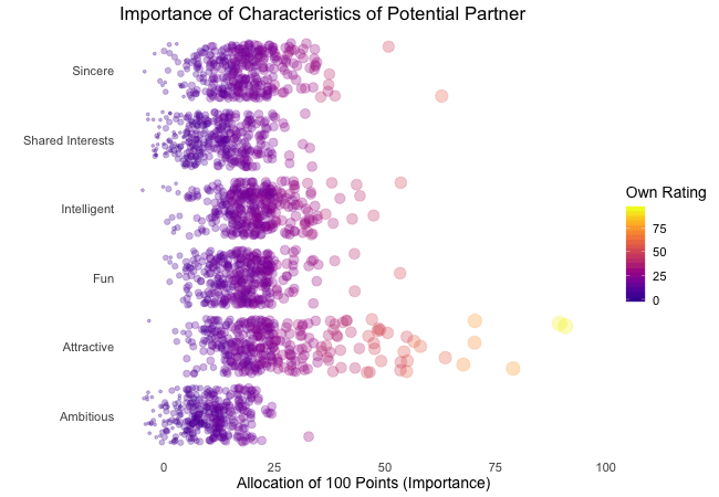
Styling transitions: ease_aes
As mentioned before, gganimate takes care of tweening and calculates additional data points to create smooth transitions between successively displayed points of actual input data. With ease_aes we can control which so-called easing function is used to 'morph' original data points into each other. The default argument is used to declare the easing function for all aesthetics in a plot. Alternatively, easing functions can be assigned to individual aesthetics by name. Amongst others quadric, cubic , sine and exponential easing functions are available, with the linear easing function being the default. These functions can be customized further by adding a modifier-suffix: with -in the function is applied as-is, with -out the function is reversely applied with -in-out the function is applied as-is in the first half of the transition and reversed in the second half.
Here I played around with an easing function that models the bouncing of a ball.
## Animated Plot
# ...add special easing function
plot1 +
  transition_states(states = rating) +
  ease_aes("bounce-in") # bouncy easing function, as-is
Dynamic labelling: {frame variables}
To ensure that we, mesmerized by our animations, do not lose the overview gganimate provides so-called frame variables that provide metadata about the animation as a whole or the previous/current/next frame. The frame variables - when wrapped in curly brackets - are available for string literal interpretation within all plot labels. For example, we can label each frame with the value of the states variable that defines the currently (or soon to be) displayed subset of actual data:
## Animated Plot
# ...add dynamic label: subtitle with current/next value of states variable
plot1 +
  labs(subtitle = "{closest_state}") + # add frame variable as subtitle
transition_states(states = rating) 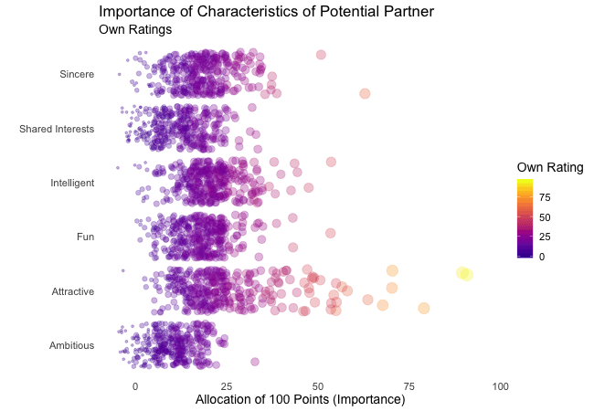
The set of available variables depends on the transition function. To get a list of frame variables available for any animation (per default the last one) the frame_vars() function can be called, to get both the names and values of the available variables.
Indicating previous data: shadow_*
To accentuate the interconnection of different frames, we can apply one of gganimates 'shadows'. Per default shadow_null() i.e. no shadow is added to animations. In general, shadows display data points of past frames in different ways: shadow_trail() creates a trail of evenly spaced data points, while shadow_mark() displays all raw data points.
We'll use shadow_wake() to create a little 'wake' of past data points which are gradually shrinking and fading away. The argument wake_length allows us to set the length of the wake, relative to the total number of frames. Since the wakes overlap, the transparency of geoms might need adjustment. Obviously, for plots with lots of data points shadows can impede the intelligibility.
plot1B + # same as plot1, but with alpha = 0.1 in geom_jitter
  labs(subtitle = "{closest_state}") +
  transition_states(states = rating) +
  shadow_wake(wake_length = 0.5) # adding shadow
The benefits of transition_*
While I simply love the visuals of animated plots, I think they’re also offering actual improvement. I feel transition_states compared to facetting has the advantage of making it easier to track individual observations through transitions. Further, no matter how many subplots we want to explore, we do not need lots of space and clutter our document with thousands of plots nor do we have to put up with tiny plots.
Similarly, e.g. transition_reveal holds additional value for time series by not only mapping a time variable on one of the axes but also to actual time: the transition length between the individual frames displays of actual input data corresponds to the actual relative time differences of the mapped events. To illustrate this, let's take a quick look at the 'success' of all the speed dates across the different speed dating events:
## Static Plot
# ... date of event vs. interest in second date for women, men or couples
plot2 <- ggplot(data = df_match,
                aes(x = date, # date of speed dating event
                    y = count, # interest in 2nd date
                    color = info, # which group: women/men/reciprocal
                    group = info)) +
  geom_point(aes(group = seq_along(date)), # needed, otherwise transition dosen't work
             size = 4, # size of points
             alpha = 0.7) + # slightly transparent
  geom_line(aes(lty = info), # line type according to group
            alpha = 0.6) + # slightly transparent
  labs(y = "Interest After Speed Date",
       x = "Date of Event",
       title = "Overall Interest in Second Date") +
  scale_linetype_manual(values = c("Men" = "solid", # assign line types to groups
                                   "Women" = "solid",
                                   "Reciprocal" = "dashed"),
                        guide = FALSE) + # no legend for linetypes
  scale_y_continuous(labels = scales::percent_format(accuracy = 1)) + # y-axis in %
  scale_color_manual(values = c("Men" = "#2A00B6", # assign colors to groups
                                "Women" = "#9B0E84",
                                "Reciprocal" = "#E94657"),
                     name = "") +
  theme_minimal() + # apply minimal theme
  theme(panel.grid = element_blank(), # remove all lines of plot raster
        text = element_text(size = 16)) # increase font size

## Animated Plot
plot2 +
  transition_reveal(along = date)
Displayed are the percentages of women and men who were interested in a second date after each of their speed dates as well as the percentage of couples in which both partners wanted to see each other again.
Most of the time, women were more interested in second dates than men. Further, the attraction between dating partners often didn't go both ways: the instances in which both partners of a couple wanted a second date always were far more infrequent than the general interest of either men and women. While it's hard to identify the most romantic time of the year, according to the data there seemed to be a slack in romance in early autumn. Maybe everybody still was heartbroken over their summer fling? Fortunately, Valentine's Day is in February.
Another very handy option is transition_filter(), it's a great way to present selected key insights of your data exploration. Here the animation browses through data subsets defined by a series of filter conditions. It's up to you which data subsets you want to stage. The data is filtered according to logical statements defined in transition_filter(). All rows for which a statement holds true are included in the respective subset. We can assign names to the logical expressions, which can be accessed as frame variables. If the keep argument is set to TRUE, the data of previous frames is permanently displayed in later frames.
I want to explore, whether one's own characteristics relate to the attributes one looks for in a partner. Do opposites attract? Or do birds of a feather (want to) flock together?
Displayed below are the importances the speed dating participants assigned to different attributes of a potential partner. Contrasted are subsets of participants, who were rated especially funny, attractive, sincere, intelligent or ambitious by their speed dating partners. The rating scale went from 1 = low to 10 = high, thus I assume value of >7 to be rather outstanding.
## Static Plot (without geom)
# ...importance ratings for different attributes
plot3 <- ggplot(data = df_ratings,
                 aes(x = variable, # different attributes
                     y = own_rating, # importance regarding potential partner
                     size = own_rating,
                     color = variable, # different attributes
                     fill = variable)) +
  geom_jitter(alpha = 0.3) +
  labs(x = "Attributes of Potential Partner", # x-axis label
       y = "Allocation of 100 Points (Importance)",  # y-axis label
       title = "Importance of Characteristics of Potential Partner", # title
       subtitle = "Subset of {closest_filter} Participants") + # dynamic subtitle
  scale_color_viridis_d(option = "plasma", # use viridis scale for color
                        begin = 0.05, # limit range of used hues
                        end = 0.97,
                        guide = FALSE) + # don't show legend
  scale_fill_viridis_d(option = "plasma", # use viridis scale for filling
                       begin = 0.05, # limit range of used hues
                       end = 0.97,
                       guide = FALSE) + # don't show legend
  scale_size_continuous(guide = FALSE) + # don't show legend
  theme_minimal() + # apply minimal theme
  theme(panel.grid = element_blank(),  # remove all lines of plot raster
        text = element_text(size = 16)) # increase font size

## Animated Plot
# ...show ratings for different subsets of participants
plot3 +
  geom_jitter(alpha = 0.3) +
  transition_filter("More Attractive" = Attractive > 7, # adding named filter expressions
                    "Less Attractive" = Attractive <= 7,
                    "More Intelligent" = Intelligent > 7,
                    "Less Intelligent" = Intelligent <= 7,
                    "More Fun" = Fun > 7,
                    "Less Fun" = Fun <= 5)
Of course, the number of extraordinarily attractive, intelligent or funny participants is relatively low. Surprisingly, there seem to be little differences between what the average low vs. high scoring participants look for in a partner. Rather the lower scoring group includes more people with outlying expectations regarding certain characteristics. Individual tastes seem to vary more or less independently from individual characteristics.
Styling the (dis)appearance of data: enter_* / exit_*
Especially if displayed subsets of data do not or only partially overlap, it can be favorable to underscore this visually. A good way to do this are the enter_*() and exit_*() functions, which enable us to style the entry and exit of data points, which do not persist between frames.
There are many combinable options: data points can simply (dis)appear (the default), fade (enter_fade()/exit_fade()), grow or shrink (enter_grow()/exit_shrink()), gradually change their color (enter_recolor()/exit_recolor()), fly (enter_fly()/exit_fly()) or drift (enter_drift()/exit_drift()) in and out.
We can use these stylistic devices to emphasize changes in the databases of different frames. I used exit_fade() to let further not included data points gradually fade away while flying them out of the plot area on a vertical route (y_loc = 100), data points re-entering the sample fly in vertically from the bottom of the plot (y_loc = 0):
## Animated Plot
# ...show ratings for different subsets of participants
plot3 +
  geom_jitter(alpha = 0.3) +
  transition_filter("More Attractive" = Attractive > 7, # adding named filter expressions
                    "Less Attractive" = Attractive <= 7,
                    "More Intelligent" = Intelligent > 7,
                    "Less Intelligent" = Intelligent <= 7,
                    "More Fun" = Fun > 7,
                    "Less Fun" = Fun <= 5) +
  enter_fly(y_loc = 0) + # entering data: fly in vertically from bottom
  exit_fly(y_loc = 100) + # exiting data: fly out vertically to top...
  exit_fade() # ...while color is fading
Finetuning and saving: animate() & anim_save()
Gladly, gganimate makes it very easy to finalize and save our animations. We can pass our finished gganimate object to animate() to, amongst other things, define the number of frames to be rendered (nframes) and/or the rate of frames per second (fps) and/or the number of seconds the animation should last (duration). We also have the option to define the device in which the individual frames are rendered (the default is device = “png”, but all popular devices are available). Further, we can define arguments that are passed on to the device, like e.g. width or height. Note, that simply printing an gganimateobject is equivalent to passing it to animate() with default arguments. If we plan to save our animation the argument renderer, is of importance: the function anim_save() lets us effortlessly save any gganimate object, but only so if it was rendered using one of the functions magick_renderer() or the default gifski_renderer().
The function anim_save()works quite straightforward. We can define filename and path (defaults to the current working directory) as well as the animation object (defaults to the most recently created animation).
# create a gganimate object
gg_animation <- plot3 +
  transition_filter("More Attractive" = Attractive > 7,
                    "Less Attractive" = Attractive <= 7)

# adjust the animation settings
animate(gg_animation,
        width = 900, # 900px wide
        height = 600, # 600px high
        nframes = 200, # 200 frames
        fps = 10) # 10 frames per second

# save the last created animation to the current directory
anim_save("my_animated_plot.gif")
Conclusion (and a Happy Valentine's Day)
I hope this blog post gave you an idea, how to use gganimate to upgrade your own ggplots to beautiful and informative animations. I only scratched the surface of gganimates functionalities, so please do not mistake this post as an exhaustive description of the presented functions or the package. There is much out there for you to explore, so don’t wait any longer and get started with gganimate!
But even more important: don’t wait on love. The speed dating data shows that most likely there’s someone out there looking for someone just like you. So from everyone here at STATWORX: Happy Valentine’s Day!

## 8 bit heart animation
animation2 <- plot(data = df_eight_bit_heart %>% # includes color and x/y position of pixels
         dplyr::mutate(id = row_number()), # create row number as ID
                aes(x = x,
                    y = y,
                    color = color,
                    group = id)) +
  geom_point(size = 18, # depends on height & width of animation
             shape = 15) + # square
  scale_color_manual(values = c("black" = "black", # map values of color to actual colors
                                "red" = "firebrick2",
                                "dark red" = "firebrick",
                                "white" = "white"),
                     guide = FALSE) + # do not include legend
  theme_void() + # remove everything but geom from plot
  transition_states(-y, # reveal from high to low y values
                    state_length = 0) +
  shadow_mark() + # keep all past data points
  enter_grow() + # new data grows
  enter_fade() # new data starts without color

animate(animation2,
        width = 250, # depends on size defined in geom_point
        height = 250, # depends on size defined in geom_point
        end_pause = 15) # pause at end of animation


