An Introduction to Dataiku DSS


In most of our customer projects with statworx Let's use R or Python. Also in our blog These are mostly topics related to the use of these two languages. In the data science sector, however, there are a large number of other tools, many of them with a graphical user interface. These include KNIME, RapidMiner or the Dataiku Data Science Studio (DSS) tool presented here. What they all have in common is that no special programming skills are required to work with them. The tools therefore also offer data science beginners a good opportunity to achieve quick results and easily share them with colleagues from other specialist areas. This is one of the reasons why we also work with Dataiku DSS in some customer projects and about this tool trainings offer.
The first part of the article will give a first overview of the features of Dataiku DSS, and in the following I will show the possibilities using a sample data set.
But first things first. If you want to see Dataiku for yourself and would like to follow the example below, you can download a free version on Dataiku download.
Dataiku presentation
Why Dataiku will make your workflow easier?
Founded in 2013, Dataiku offers a collaborative data science platform that allows the entire workflow of a data sciences project to be processed. This includes the integration of Hadoop or Spark, data transformation with a graphical user interface, the use of various machine learning algorithms, and data visualization with dashboards. Due to the wide range of functions, the tool can be used by data scientists, data analysts and data engineers. Project management is also possible via Dataiku, for example through to-do lists.
Thanks to its various functions, Dataiku was classified as a visionary in the Gartner Magic Quadrant for Data Science Platforms in 2018.
A big advantage of Dataiku is the click-or-code option. This option makes it possible to use either the graphical interface or R/Python code to perform data preparation, for example. This allows you to create any function yourself if the predefined range of functions is not sufficient. The graphical user interface offers a large number of functions and a syntax similar to Excel.
The structure of Dataiku DSS
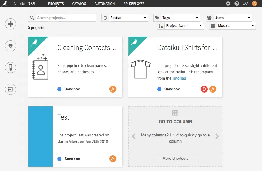
On the homepage, there is an overview of all projects. In addition to two examples from Dataiku DSS, another test project was created here. For a larger number of projects, it is also possible to search for them.
If you click on one of the projects, a summary of the project opens with the number of data sets, models, dashboards, etc. used.
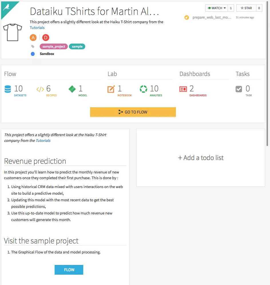
In addition, a short summary of the project, similar to a readme file on Github, and a to-do list can be created. Changes can also be followed via the “Changes” tab.
If you click on the button GO TO FLOW Open the project workflow.
The workflow shown is run from left to right and shows the implementation of a simple model. First, various data sets are loaded. The next steps are a join, data preparation, training and, as a final step, scoring the models.
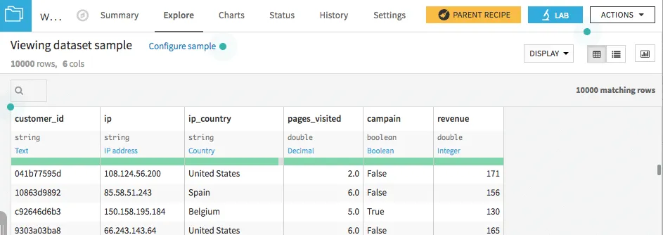
In addition to the good overview, one advantage of the workflow is that you can quickly process the individual steps and directly observe changes to the data sets. By double-clicking on the created data set web_last_month_enriched Is it possible, for example, to see what has changed and in which format the individual columns are saved. Especially with unknown data sets, this helps to get a quick overview of the data.
Wine quality prediction - an example
As an example, a problem should be chosen in which the quality of a wine must be predicted using various influencing variables. The two data sets used can be found on the UCI Machine Learning Repository page at UCI datasets to be downloaded. Each data set contains data for one type of wine.
The quality of a wine is rated on a scale of 0-10, with 10 being the highest category. Various sensory data, such as the pH value or the total sulfur dioxide content, are used as influencing variables. The meaning of the individual variables can be found in more detail in Dataset Description be read up. For this blog, the quality of wine is divided into just two groups. For this purpose, all “bad” wines with a rating of less than or equal to 5 are combined in one category and all wines with a rating greater than 5 are combined in another category.
The first step is to upload and merge the data sets. The database icon can be used to use a new data set in Dataiku. The various options of data sources are then displayed. Either various database connections are used or CSV files can be loaded. For the current problem, the two data sets for red and white wine must be loaded as CSV files. Immediately after loading the data set, it is displayed with the corresponding variable types. In most cases, the suggested values are correct, but should they differ, the values can also be changed directly.
Furthermore, by clicking on the variable name and Analyze An overview of the variable can be obtained directly. Unter dem Reiter Charts It is also possible to create simple graphics using drag & drop to get an overview of the data, allowing you to choose between different types of charts. Especially with unknown data sets, this is an important step towards understanding the data and possibly creating new features or identifying outliers.
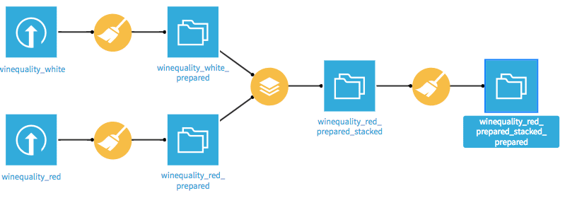
After both records have been loaded, they must be merged. To do this, the flow view must first be called up via the small graph shown at the top left. In this view, all modeling steps from data preparation to final deployment are shown grapfisch through a flow chart. Various symbols are used for data sets and various operations. The stacking icon is used in the flow view to merge the data.
In the following view, the other data set must be selected and the name of the new data set must be selected.
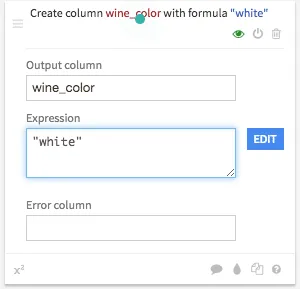
Only a model should be created for our problem and the color of the wine should be included as an influencing variable. To do this, a new variable must first be created for both data sets, which contains the respective color, i.e. white or red. If you now click on the data set once in the flow view, various visual recipes are displayed, which represent different operations. Adding the wine color is a data preparation step, so you have to click on the broom icon. One or more data preparation steps can then be carried out. This can be done via Add a new step a new step will be added. To add the new variable, click on Strings and the selection Formula a formula can be entered. The new variable is wine_color and the corresponding color is called as an expression, i.e. either white or red registered.
By clicking on RUN The corresponding operation is performed.
After the data sets have been combined, the new categories are created. The data processing icon is used again for this purpose. On it is again about String>Formula The formula editor is opened. The corresponding formula is if (quality <= 5, '0', '1'). The new variable is quality_classification called. In order to use the variable during training Quality Not to be used as an influencing variable will be excluded in the next step. For this purpose, under the category filters and Delete/Keep columns by name the variable Quality used. By clicking on RUN the appropriate steps are carried out.
The actual training of the model takes place below. To train a model, simply click on the training data set and then click on Lab > Visual Analysis > New a new model can be trained. In the new view, under the tab Models The first model is created. After choosing the machine learning problem, in our case Prediction, and the target variable, a simple model can be trained directly or via the tab design You can create your own models.
In the design, various parameters can be changed and the individual algorithms can be selected. There are four categories BASIC, FEATURES, MODELING and ADVANCED.
In the category BASIC Parameters for the train/test split and the error measure to be optimized can be specified. If further feature engineering steps are to be carried out or individual variables are to be excluded, this can be done in the category FEATURES happened. It is also possible to define various interactions between the various variables and how to deal with missing values. Under the category MODELING There is a selection of almost all common machine learning models, such as various tree-based methods, regression methods and neural networks. Various hyperparameters can be specified for each model, which should be used for grid search. If further models are to be tried out, you can go to the point Add Custom Python Model Our own models are also being developed. About ADVANCED The Python environment can be changed and the weights of the individual results can be changed.
In the example, the two models suggested by Dataiku, Random Forest and Logistic Regression as well as XGBoost were tested. By clicking on Train the models are trained. At the end of the training, the optimal parameters determined by Grid Seach, a list of the most important parameters, the distribution of training and test set, and training time are displayed for each model. By clicking on a model, various information about the model is displayed, such as performance values or input variables used.
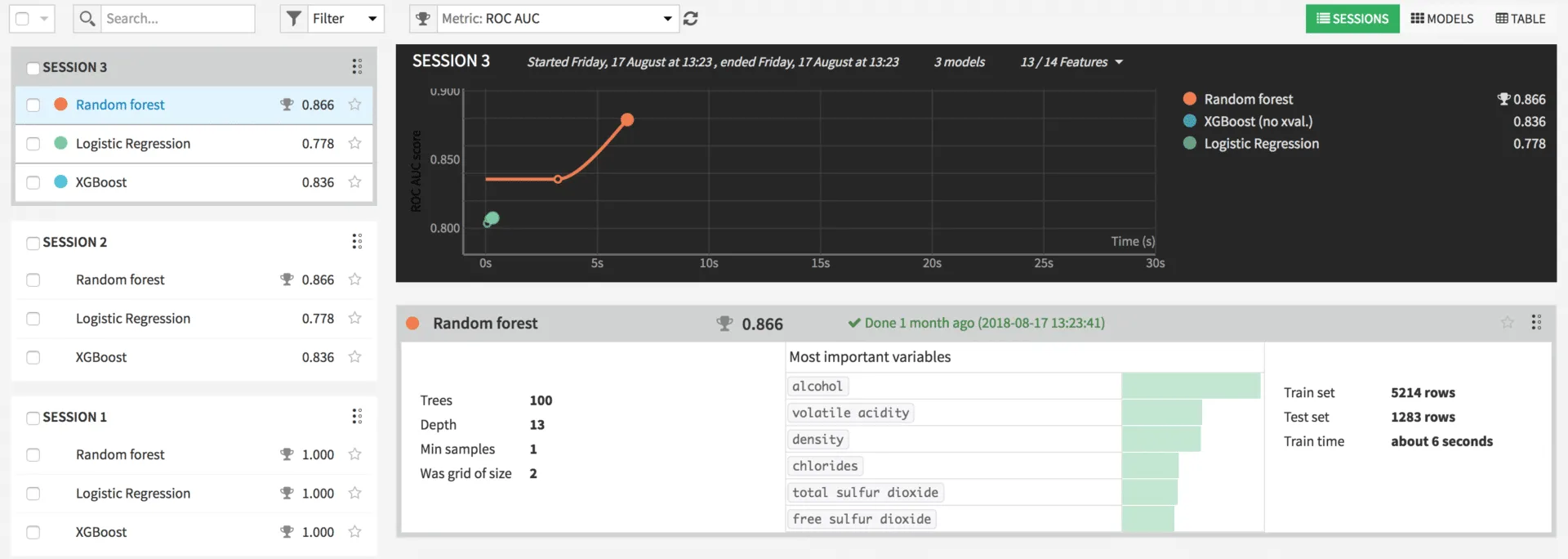
In real problems, there can of course be criteria other than accuracy for choosing the model, such as the interpretability of a model or linear relationships. To go live, in the detailed view of the model, the Deploy button can be pressed. The model can now be applied to new data.
The entire flow is now in the following form:
Summary and outlook
This article should give a first overview of the tool. Of course, there are many other features that have not been discussed for now.
I hope I've piqued your interest though. When working on our projects, Dataiku DSS often makes our work a lot easier. In addition, during our training courses, we recognize that the tool is easy to learn. Especially for people who have worked little with data before.


