Data Dashboard with Bokeh

- How are the data structured?
- What are the special characteristics?
- How can the data be graphically presented?
Of course, this list can be expanded with any number of questions. The following blog article is intended to help with solving the last question. Using a simple dataset, we want to show you how you can build a dashboard with the Python library Bokeh with manageable effort. This can then not only be used for simple data visualization, but also for live operation on a website or similar.
What prerequisites should you bring along?
Zur Umsetzung dieses kleinen Projektes solltet ihr eine aktuelle Version von Python 3 auf Eurem PC installiert haben. Falls nicht, ist es am einfachsten, Anaconda zu installieren – hiermit seid ihr bestens für dieses Projekt ausgestattet. Durch das Setup werden nicht nur Python, sondern auch viele weitere Bibliotheken wie Bokeh installiert. Zudem bietet es sich an, dass ihr bereits ein wenig Erfahrung in der grundsätzlichen Funktionsweise von Python sammeln konntet und vor der Benutzung der Kommandozeile/Terminal nicht zurückschreckt. Für die Erstellung des Dashboards solltet ihr zudem über einen passenden Texteditor/IDE wie z.B. Atom, PyCharm oder Jupyter verfügen. Ein Jupyter Notebook könnt ihr - sofern ihr Anaconda installiert habt - sehr einfach starten und müsst keine zusätzlichen Installationen vornehmen. Die Vorteile von Jupyter zeigt unser Data Scientist Marvin in einem Blogbeitrag.
To implement this small project, you should have a current version of Python 3 installed on your PC. If not, the easiest way is to install Anaconda - this will equip you well for this project. The setup not only installs Python but also many other libraries like Bokeh. It is also beneficial if you already have some experience with the basic functionality of Python and are not afraid of using the command line/terminal. For creating the dashboard, you should also have a suitable text editor/IDE like Atom, PyCharm, or Jupyter. If you have Anaconda installed, you can start a Jupyter Notebook very easily without additional installations.
Bokeh - A brief introduction to the origin of the name
The original meaning of Bokeh comes from photography and is derived from the Japanese word boke. It means something like blur. The name composition with the word boke and the letter h is attributed to Mike Johnston, aimed at simplifying the English pronunciation.
Now back to the actual application of Bokeh. The library makes it relatively easy to create interactive graphics inspired by D3.js, where, for example, sections can be enlarged by mouse click and then saved. For data exploration applications, this feature is a good way to improve your understanding of data.
Our dataset
For the dashboard, we don't want to generate fictitious numbers and display them, but use a dataset as real as possible. For this, we turn to gastronomy. A waiter took the trouble to record the tips he received after his shift and some additional data on his customers. The dataset is included in the Seaborn graphics library and can be easily downloaded.
import seaborn as sns
tips = sns.load_datset('tips')
Looking at the first lines of the dataset, it shows that the waiter has recorded a manageable number of different variables. An advantage of the data is their different structure, so variables with different scales are included, which we can use for various visualizations in our dashboard.
Possibilities of a Bokeh dashboard
After gaining an initial overview of our data, it's time to build the dashboard with Bokeh. Basically, there are two possibilities:
- Creating an HTML document including all illustrations
- Starting a Bokeh server
The first option offers the advantage that a dashboard can be very easily saved in the form of an HTML document, but interactive design options are only limited, so we present the second option in more detail in this blog article. Starting the Bokeh server works as follows:
- Open Terminal/Bash console
- Switch to the directory of the Python script using cd
- Start the dashboard with bokeh serve
--show name-of-script.py
The --show command is not necessarily required for the dashboard, but it has the advantage that the dashboard is displayed directly in the browser.
Creating the Bokeh dashboard
Now let's proceed to how to build the dashboard. Besides the various visualizations, the dashboard can be modularly built with widgets like a construction kit. On the Bokeh website, there are a variety of different widgets that allow the functions to be extended as desired. The goal of our dashboard should be that it fulfills the following properties:
- Two different visualizations
- Interaction elements for selecting data for our representations
As visualizations, we want to include a histogram/bar chart and a scatter plot in our dashboard. For this, we import the figure class with which we can implement both visualizations. Here are three notes:
- For Bokeh graphics, it is crucial what kind of scale the data has. In our case, we have both nominal scale data and ratio scale data. Therefore, we create a histogram and a bar chart for the different cases.
- Before we can display a histogram with Bokeh, we must first define the class sizes and the respective number of observations in the classes, as this cannot be done directly in Bokeh, we implement this step with numpy and the
np.histogram()function. - Additionally, we convert our data into a dictionary so that we can easily change it later and make the dashboard interactive.
The following Python code shows how to implement this in connection with the Bokeh server and our dataset.
import numpy as np
from seaborn import load_dataset
from bokeh.io import curdoc
from bokeh.layouts import row
from bokeh.models import ColumnDataSource
from bokeh.plotting import figure

# Set the dashboard title
curdoc().title = "Histogram/Bar Chart"

# Load the dataset
tips = load_dataset("tips")

# VISUALIZATIONS
# Create histogram with Numpy
top_hist, x_hist = np.histogram(tips.total_bill)

# Convert data to dict
source_hist = ColumnDataSource(data=dict(x=x_hist[:-1], top=top_hist))

# Create general plot
hist = figure(plot_height=400, plot_width=400,
              title="Histogram",
              x_axis_label='total_bill',
              y_axis_label='Absolute frequency')

# Display the bar chart
hist.vbar(x='x', top='top', width=0.5, source=source_hist)

# Categorical variables
kat_data = tips.smoker.value_counts()
x_kat = list(kat_data.index)
top_kat = kat_data.values

# Convert data to dict
source_kat = ColumnDataSource(data=dict(x=x_kat, top=top_kat))

# Create general plot
bar = figure(x_range=x_kat, plot_height=400, plot_width=400,
             title="Bar Chart",
             x_axis_label='smoker',
             y_axis_label='Absolute frequency')

# Display the bar chart
bar.vbar(x='x', top='top', width=0.1, source=source_kat)

# Add both visualizations to the main document
curdoc().add_root(row(hist, bar))
Next, we add our scatter plot to our dashboard, for this we also create a figure with an associated data dictionary. This can then be easily added to our dashboard.
# Add the scatter plot
curdoc().add_root(row(hist, bar, scatter))
For the sake of clarity, we do not display the entire program code here, but only the essential excerpts. You can find the entire source code in our Git repository. For this example, the corresponding file is called bokeh-hist-bar-scatter.py. Our dashboard now looks as follows:
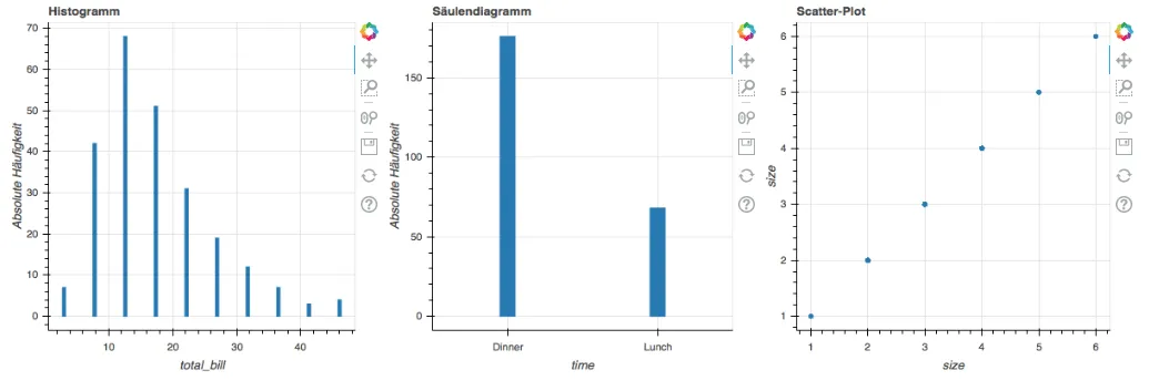
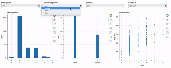
So far, our dashboard has fulfilled the first requirement, what is still missing are the interaction elements in English: widgets. The function of the widgets should be to select the various variables for both plots. Since our scatterplot has both an x-axis and a y-axis, we use two select widgets to choose data for both axes and limit ourselves to variables with ratio scale, i.e., numerical nature.

How do you give the dashboard the necessary interaction?
A significant shortcoming of our dashboard so far is that it only displays one dataset but does not update when we, for example, select other variables in the widgets. We solve this now with the update_data function and a for-loop. With the function, we change the data in our histogram/bar chart as well as the scatter plot. We obtain the currently selected variables in our widgets by accessing the value attribute. Then, we can update the dict for our data. For the histograms, it is crucial whether a categorical variable is present. We cover this case distinction with the if-condition, depending on the variable either the upper or lower diagram is updated. With the for-loop, the update_data function is executed as soon as a change occurs in one of our widgets.
def update_data(attrname, old, new):
    """Update data and labels"""
    # Scatter diagram
    scatter.xaxis.axis_label = select_x.value
    scatter.yaxis.axis_label = select_y.value
    x = select_x.value
    y = select_y.value
    source_scatter.data = dict(x=tips[x], y=tips[y])
    # Bar chart
    data_cat = tips[select_cat.value]
    summary = data_cat.value_counts()
    bar.x_range.factors = list(summary.index)
    source_kat.data = dict(x=list(summary.index), top=summary.values)
    bar.xaxis.axis_label = select_cat.value
    # Histogram
    data_hist = tips[select_hist.value]
    top_hist_new, x_hist_new = np.histogram(data_hist)
    source_hist.data = dict(x=x_hist_new[:-1], top=top_hist_new)
    hist.xaxis.axis_label = select_hist.value

for w in [select_hist, select_cat, select_x, select_y]:
    w.on_change('value', update_data)
Thus, our dashboard is now complete and has achieved the goal. You can find the code for the finished dashboard in the file bokeh-dashboard-final.py under the following link and here it is in action:
Conclusion
In conclusion, we would like to draw a short conclusion about our dashboard. It has been shown that the following steps are necessary for an interactive Bokeh dashboard:
- Preparation of the data and creation of dictionaries
- Determination of the visualization and associated scales
- Addition of suitable widgets
- Definition of one or more functions for updating the diagrams
Once this basic framework is in place, you can expand your Bokeh dashboard with widgets and representations as desired. You should always keep the object-oriented working method in mind and be aware of the various classes and attributes of the objects. By implementing in Python, processing data, e.g., with the pandas library is easily possible. With Bokeh, you save yourself the effort of defining the layout in HTML code and also writing the interactions in JavaScript. Have fun creating your own dashboards!
References:


